MODERNIZING A LEGACY BRAND
McDonald’s, the company that put “fast food” on the map over 60 years ago, knows how to make a hamburger with exact precision taste the same, whether you’re in Tokyo or San Francisco. But when it came to restaurant design, no two were the same. As the brand expanded globally, the US market realized that it needed to modernize experience and create consistency.
In 2005, McDonald’s Reimage Program was launched, with the goal of modernizing the portfolio of US restaurants, impacting exterior, interior, and drive-thru design for $14,000 locations.
RESULTS
Sales lift of 6% - 7% in the first year, continuing to build in years two and three.
20% savings off of standard design packages.
An overall ROI of 11% to McDonald’s Corporation
ROI of 11-13% to the individual franchisees.
After 50% of stores of all US restaurants were modernized, the brand experience a halo effect, increasing overall brand perception and total sales increase 5% on average.
AMBITIOUS GOALS
For my retail interiors team, the Reimage Program required a mult-faceted approach:
Create a portfolio collection of interior designs that appeal to a variety of customer segments and geographic areas that can consistently scale for rollout.
Craft a robust sell-in plan for franchisee organization.
Provide localized solutions with a range of investment levels.
Review and approve process based on design standards for each location.
Implement at lightning speed rate of 1000 restaurants per year.
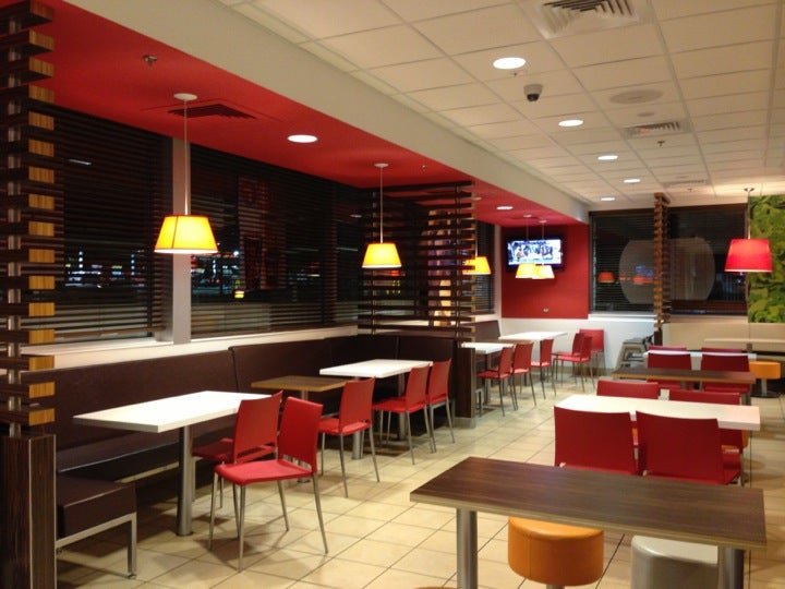
“Form” Design: Hacienda Heights, CA
standard portfolio Designs
As the lead interior designer of the McDonald's retail design team, I was a key member in designing and implementing a portfolio collection of nine distinctive interior designs packages. This diverse range of options conveys the McDonald’s brand essence and has impacted all 14,000 new and remodeled locations within the US. Working cross functionally with franchise organization, vendors partners and executive leadership, we delivered high-quality design solutions that enhanced the customer experience, and drove profit year over year.
FLEXIBILITY WITHIN A FRAMEWORK
Standard designs were created based on overall branding guidelines, customer needs, and specific trade area demographics.
The layout of each design based on three standard formats, with three color palettes, and localized options for franchisees. The designs were then adapted for each unique location. The result was a Collection of Designs that franchisees could select based on each location.
“Fresh and Vibrant” Design: Oak Brook, IL
“Allegro” Design: Plant City, FL
“Simply Modern” Design: Columbus, OH
“Origin” Design: Orlando, FL
design style guides
At my time with McDonalds, I was involved with designing, developing, and adapting 8 standard decor packages for national rollout. With the development of each design, a Design Style Guide was created to outline the furniture, material and graphic options for each decor package. These guides were used to help communicate the options to franchisees, but also educate the outside design and fabrication partners on how to adapt the design to each site.
Localized graphics
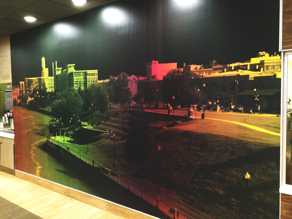
Localizing was an important element for both the brand and the franchisees, as a way to stay connected to their communities. Graphics templates were created that allowed elements to be changed to fit locally relevant content, whether in text or photography with template filter For flagships or unique stores, completely custom graphics were created to tie into the market and the decor.
Custom graphic created for San Francisco location.
reimagining the ordering experience
As the main touchpoint in the customer journey, the front counter and menu board experience was redesigned to be simplify the ordering process. Through experience and journey mapping, we designed the process to ease the needs of the customer and enhance functionality of the crew. The solutions was modular, optimized efficiency and solved for integration of digital menu boards and and paved the way for seamless ordering kiosks.
Test mock up at the Innovation, with 10 pilot locations in 2 markets.
Implementation Guidelines for remodel solutions.
AIRPORT formats
Airports required an adaptable of design standards and special consideration to operational changes and individual airport standards. I was lead designer for Malls and Airports, and managed 8 locations in Chicago’s O’Hare, as well as locations in Detroit Metro Airport, Portland, and Seattle.
Chicago O’Hare International Terminal
Portland Airport
Special Formats
Special Formats, like McCafe kiosks were concepted and tested in airport locations and retail partnership opportunities.
McCafe Kiosk for Walmart
McCafe Bakery Concept
McDonald’s worldwide Convention
I was lead designer on convention spaces for McDonald’s Restaurant Design Group for 4 conventions over 8 years. New designs were often prototyped and unveiled at the Mcdonald’s Worldwide Convention, where we built out full scale environment and franchisees could experience the first hand before rolling out to stores.
CRAFT Decor at McDonald’s Worldwide Convention
“Craft” Design: Indianapolis, IN


